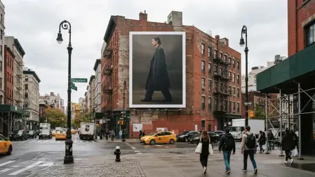

The campaign effectively uses the architectural grit of SoHo as a natural frame to contrast the polished world of Italian luxury, serving as a pivotal case study in how high-fashion houses maintain cultural dominance by embracing simplicity over the frenetic noise of typical metropolitan advertising. In the year 2026, where consumer attention spans are increasingly fragmented by localized digital content, the physical presence of a massive, unadorned billboard operates as a definitive cultural landmark. By transforming a standard media purchase into a towering architectural statement, the brand moves beyond mere commerce, instead asserting a form of visual authority that demands reflection rather than reaction. The sheer scale of the installation allows it to bypass the usual clutter of the streetscape, offering a moment of aesthetic clarity that feels rare in the hurried environment of New York City. This approach highlights a fundamental shift in luxury marketing, where the most powerful message is often the one that remains unspoken, relying on a sophisticated audience to interpret the nuances of the brand’s creative direction.
The Strategy: Minimalist Luxury in Modern Commerce
A defining characteristic of this campaign is its radical commitment to visual restraint, a move that signals an immense level of brand maturity and confidence in the marketplace. There are no traditional calls to action, no tracking URLs, and no detailed product descriptions to distract the viewer from the central imagery. This minimalist approach functions on the assumption that the brand possesses enough cultural equity that the name alone, rendered in stark typography, is sufficient to anchor the entire advertisement. By stripping away the promotional language that typically saturates urban environments, the campaign creates a vacuum of information that viewers naturally fill with their own aspirations and associations. This level of restraint is a hallmark of high-tier premium positioning, demonstrating that the house does not need to explain its relevance to the modern consumer. Instead, the imagery acts as a visual shorthand for a lifestyle that is already understood by the target demographic, prioritizing long-term brand building over short-term transactional gains.
The decision to treat the billboard as a monumental editorial spread allows the brand to maintain the integrity of its fashion photography without the dilution often caused by aggressive graphic design. In many outdoor campaigns, the artistic quality of the original photography is compromised by the addition of logos, headlines, and secondary graphics intended to drive immediate sales. However, this Manhattan placement preserves the raw, high-contrast aesthetic of a luxury magazine spread, simply scaling it up to match the proportions of the city. This strategy turns the urban environment into a living gallery where the pedestrian experience is elevated through high-concept art. By refusing to over-design the creative for the outdoor medium, the brand ensures that the imagery remains the primary focal point, forcing the city itself to adapt to the brand’s aesthetic rather than the other way around. This editorial expansion effectively bridges the gap between the private experience of reading a fashion journal and the public experience of navigating a world-class city, creating a unified visual identity across all touchpoints.
Urban Context: Integration with the Manhattan Canvas
The successful execution of this campaign depends heavily on its interaction with the “third wall” of architecture, utilizing the specific textures of Downtown Manhattan to enhance the creative impact. The red and brown brickwork of the surrounding buildings serves as a gritty, historical backdrop that emphasizes the smooth, hyper-polished finish of the advertisement. This juxtaposition is not accidental; it is a calculated effort to ground the brand’s ethereal luxury in the tangible reality of the city’s industrial past. The SoHo area, famous for its cast-iron architecture and creative heritage, provides a context where the billboard does not clash with its surroundings but rather integrates into the local rhythm. By using the city’s existing structures as a natural frame, the campaign avoids the aesthetic friction that often occurs when modern brands attempt to force their identity onto a neighborhood. Instead, the billboard feels as though it has always belonged there, emerging from the urban fabric to command attention from every passing taxi and pedestrian.
Selecting a location frequented by global tastemakers and industry leaders ensures that the message reaches an audience already predisposed to appreciate minimalist, high-concept design. Unlike Times Square, which is characterized by sensory overload and tourist-focused messaging, the Downtown Manhattan corridor attracts those who define contemporary trends. The layered streetscape of this area provides a tactile reality that contrasts sharply with the aspirational world presented by the model in the imagery. This creates a powerful environmental synergy where the advertisement becomes a focal point of discovery rather than a disruption. As natural light changes throughout the day, the shadows of neighboring buildings play across the billboard, giving the static image a dynamic quality that evolves with the time. This environmental interaction reinforces the brand’s status as a leader that is both an inhabitant of the city and a cultural icon that exists independently of its surroundings, bridging the gap between the street level and the high-fashion horizon.
Industry Shifts: The Power of Physical Grandeur
This campaign represents a broader industry pivot toward large-format physicality in a world that has become increasingly saturated with fleeting digital impressions. While social media advertisements are often scrolled past or hidden by algorithms, a massive physical installation offers a sense of permanence and grandeur that a mobile device simply cannot replicate. In 2026, the value of physical space has increased as brands look for ways to reclaim a sense of cultural weight and authority. By occupying a significant piece of New York’s visual real estate, the brand creates a monument that cannot be silenced by a user’s settings or a software update. This physical presence provides a sense of legitimacy that digital ads often lack, signaling to the public that the brand is confident enough to invest in the tangible world. These “monuments” of advertising serve as anchors for the brand identity, providing a consistent point of reference that remains visible to thousands of people simultaneously, fostering a shared cultural experience that is absent from individualized digital feeds.
The shift toward prioritizing a “vibe” or a specific persona over individual product features is evident in how the model is styled and presented in this campaign. Rather than showcasing a specific handbag or pair of shoes for purchase, the imagery sells a comprehensive identity characterized by detached cool and urban sophistication. The model, wearing oversized sunglasses and dark leather, represents an attitude that the consumer is invited to inhabit. This trend in luxury marketing focuses on selling an emotional connection and an aesthetic lifestyle rather than a set of functional items. By focusing on the persona, the brand creates a more enduring bond with its audience, as the consumer is encouraged to align their own identity with the one projected on the billboard. This approach is particularly effective in a sophisticated market like Manhattan, where the demographic is more interested in the cultural narrative of a brand than in the specific technical details of a garment. The billboard thus becomes a mirror of the audience’s aspirations, reflecting a desired level of elegance and mystery that defines the modern luxury experience.
Technical Precision: Partnerships and Visual Hierarchy
The technical success of the Manhattan placement is a direct result of the collaboration between the brand’s creative department and media specialists who understand the mechanics of outdoor visibility. Large-format advertising requires a unique understanding of how images are perceived from various distances and angles, as the viewer might be looking from a sidewalk directly below or from a vehicle several blocks away. Specialists like SEEN and BM Outdoor ensure that the scale of the creative is optimized for maximum impact without losing its clarity. In this execution, the brand name is positioned with mathematical precision to ensure it is the first thing a viewer recognizes. The use of high-contrast white lettering against a dark, moody background maximizes legibility, which is crucial in an environment where the average “dwell time” is only a few seconds. This technical foresight ensures that the brand identity is effectively communicated even to those who only catch a fleeting glimpse of the billboard as they navigate the busy streets.
Strategic placement was also critical in maintaining a visual hierarchy that guides the human eye through the composition without the need for complex elements. By positioning the billboard at a “commanding street-level” height, the campaign ensures that it remains visible from a distance while still feeling personally accessible to pedestrians on the ground. If the placement were too high, it might lose the intimate human connection established by the portrait; if it were too low, it would be obscured by the constant flow of city traffic. This balance allows the image to feel like a part of the pedestrian’s world, creating an interaction that is both monumental and grounded. The engineering behind the lighting and the physical mounting of the advertisement also plays a role in its effectiveness, ensuring that the colors remain true and the image remains sharp under the varying weather conditions of New York City. This level of technical excellence proves that the most effective minimalist designs are often the ones that require the most rigorous background planning and execution to appear effortless.
Visual Psychology: Anonymity as a Luxury Asset
The psychological impact of the imagery is amplified by the specific styling of the model, who wears oversized black sunglasses that create a sense of elite anonymity. In the language of luxury branding, sunglasses often symbolize a person who is important enough to be watched but who does not need to return the gaze of the observer. This creates a specific power dynamic where the brand remains the “observed” and the public becomes the “observer,” reinforcing a sense of exclusivity and mystery. By placing this image on a monumental scale, the campaign invites the public to engage with a persona that is fundamentally untouchable. This sense of “armor” or urban uniform resonates deeply with the aesthetic culture of New York, a city that has long had an affinity for sophisticated, edgy fashion and the privacy that comes with wearing black and leather. The portrait thus taps into a localized psychological preference for understated strength, making the brand feel like a native participant in the city’s unique fashion landscape.
This visual strategy also facilitates a seamless bridge between the physical and digital worlds, as the billboard’s landmark status encourages organic social media engagement. In the current media landscape, a successful physical advertisement is one that people feel compelled to photograph and share online. The simplicity and high contrast of the Gucci portrait make it an ideal backdrop for mobile photography, allowing the campaign to go viral without the need for a forced digital call to action. People naturally gravitate toward visually striking elements in their environment, and by providing a clean, iconic image, the brand allows its audience to become its most effective messengers. The billboard functions as a temporary monument that people want to document, effectively turning every passerby into a potential contributor to the brand’s digital narrative. This organic reach is more valuable than paid social media impressions because it comes with the implicit endorsement of the individual sharing the content, proving that a well-executed physical placement can drive more digital conversation than a direct digital campaign.
Strategic Outcomes: Why Simple Communication Succeeds
The success of the 2026 campaign proves that in the realm of high-impact outdoor advertising, scale is the primary factor in determining long-term brand recall. When a placement reaches a certain size in a high-traffic neighborhood like SoHo, it stops being a mere advertisement and starts being a landmark. Pedestrians and motorists begin to use the location as a point of reference, which significantly increases the number of times the brand name is reinforced in their memory. This “landmark effect” ensures that the brand remains top-of-mind even after the consumer has left the immediate vicinity of the billboard. By choosing to go big rather than complex, the brand ensures that its message is unmistakable and difficult to ignore. The strategic use of scale allows the brand to own a specific piece of the urban environment, creating a sense of permanence that is highly valued in the luxury sector where heritage and longevity are key components of brand value.
Adopting a “non-ad” aesthetic allows the brand to bypass the natural psychological resistance that modern consumers have toward traditional sales tactics. In an era where people are constantly bombarded by aggressive marketing, a minimalist portrait that looks more like a high-fashion editorial feels refreshing and authentic. By mimicking the visual language of art and journalism rather than retail, the brand positions itself as a cultural contributor rather than just a commercial entity. This approach builds trust with a sophisticated urban audience that prides itself on being immune to standard advertising. High-contrast typography and minimalist imagery ensure that the brand identity is the first and last thing a viewer sees, even during a fleeting glance from a moving vehicle. Selecting a location where the existing architecture complements the brand’s aesthetic further reinforces this “intentional” and premium feel. When the environment and the creative are in harmony, the entire campaign gains a level of credibility that is impossible to achieve through digital channels alone, cementing the brand’s status as a leader in the global luxury market.
Future Implementation: Moving Beyond Traditional Placements
The results of the 2026 Downtown Manhattan initiative demonstrated that luxury brands must prioritize local context and architectural integration to remain relevant in a post-digital advertising landscape. Future marketing strategies should focus on identifying physical spaces that offer more than just visibility; they must offer a narrative alignment with the brand’s identity. It was found that placements which respected the existing urban fabric generated higher levels of consumer trust and longer dwell times compared to intrusive digital screens. Moving forward, the most successful campaigns will likely be those that treat the city as a canvas rather than a billboard, seeking out locations that provide a “natural frame” for the creative content. This shift requires a deeper partnership between creative directors and urban planners to ensure that large-format advertisements contribute to the aesthetic value of a neighborhood rather than detracting from it.
Actionable insights from this period suggest that brands should reinvest in high-quality physical photography that can withstand the scrutiny of being scaled to monumental sizes. The move away from cluttered, information-heavy designs toward minimalist, editorial-style imagery has proven to be the most effective way to capture the attention of high-net-worth individuals in urban centers. Future implementations will likely involve even more sophisticated uses of environmental elements, such as interactive lighting or materials that change texture based on the weather, to further blur the line between advertising and urban art. By focusing on the “vibe” and the psychological power of the image, luxury houses can continue to assert their dominance in physical spaces that digital competitors cannot occupy. The success of this campaign served as a reminder that in the theater of the city, the most confident brands are the ones that speak with clarity and restraint, allowing their visual presence to define the cultural conversation for years to come.