In the world of B2B marketing, established conversion playbooks often dictate that light-themed landing pages, praised for their readability and professional aesthetic, are the safest and most effective choice for generating leads. This research summary details a direct challenge to that assumption, chronicling an A/B test where a visually unconventional dark-themed landing page was pitted against a “best practice” light-themed design for a niche B2B SaaS product. The results were not only surprising but also provided a profound lesson in the power of audience-specific psychological signals over generalized design principles. The dark variant, despite attracting a lower click-through rate, ultimately generated significantly more conversions, prompting a deeper investigation into why a design that broke the rules resonated so strongly with its intended audience. This study serves as a critical case for moving beyond aggregate data and grounding optimization strategies in the nuanced context of a target market’s identity and environment.
Challenging the Conversion Playbook A Dark Theme’s Surprising Success
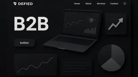
The central experiment revolved around a fundamental question of design philosophy: does adherence to widely accepted best practices guarantee optimal performance, or can a contextually tailored, unconventional approach yield superior results? The A/B test was designed to answer this by comparing two landing pages for a SaaS product aimed at the industrial fleet repair sector. One page followed the established B2B playbook, featuring a light background, clean typography, and a standard blue call-to-action button. The other, the control variant, deliberately defied these conventions with a full dark theme, high-contrast white form fields, and a starkly different aesthetic intended to mirror the industrial environment of its target users.
The core challenge that emerged from the data was not merely identifying the winner, but understanding the mechanism behind its success. The light-themed page, as predicted by some metrics, achieved a higher click-through rate (CTR), suggesting it was more initially appealing or enticing to a broader set of users clicking through from advertisements. However, this surface-level engagement failed to translate into meaningful business outcomes. The dark-themed page, in stark contrast, proved far more effective at converting qualified visitors into leads, resulting in 42% more total conversions. This discrepancy forced a re-evaluation of what “performance” truly means, shifting the focus from initial clicks to the deeper psychological factors that drive a user to complete a high-commitment action, such as filling out a detailed lead form.
The Conventional Wisdom Why a Light Theme Was the Safe Bet
Established best practices within B2B landing page design overwhelmingly favor light backgrounds, and for sound reasons. Light themes with dark text generally offer superior readability, especially for text-heavy pages, reducing eye strain and making information easier to scan. This approach is also associated with a clean, professional, and modern aesthetic that conveys trustworthiness and clarity, which are critical attributes when marketing high-value software solutions. Furthermore, principles of accessibility often guide designers toward high-contrast, light-background layouts to ensure content is usable for the widest possible audience. These aggregated data points and design theories formed a compelling argument that the light variant was the logical and safe choice for a lead generation campaign.
The specific target audience for this SaaS product—owners and operators of industrial fleet repair shops—seemed to further support this conventional hypothesis. These are busy professionals operating in demanding, practical environments, and it was presumed that a straightforward, easily digestible, and professional-looking landing page would be most effective. The expectation was that an aesthetic mirroring mainstream business software would signal credibility and ease of use, reducing friction for an audience that values efficiency over stylistic novelty. The light theme was therefore designed not just as a default but as a strategic choice, intended to align with perceived user preferences for clarity, professionalism, and trustworthiness in a B2B purchasing decision.
Research Methodology Findings and Implications
Methodology
The study was executed as a rigorous 50/50 A/B split test, distributing paid traffic evenly between the two landing page variations. The traffic sources were Google Ads search campaigns and Meta platforms, including Facebook and Instagram, ensuring that the test captured user behavior across different intent levels and advertising environments. This multi-platform approach was crucial for verifying that the observed performance differences were due to audience preference rather than an anomaly specific to a single channel’s algorithm or user base. The test was designed to run for a duration sufficient to collect a statistically significant number of impressions, clicks, and conversions, allowing for confident conclusions to be drawn from the performance data.
To ensure the validity of the findings, the experiment adhered to a strict principle of variable isolation. The control page (dark theme) and the treatment page (light theme) were identical in every aspect except for their visual presentation. This meant that the headline, body copy, value proposition, form fields, and overall page layout remained constant across both versions. The distinct variables were limited to the background color scheme, text color, form field contrast, call-to-action button design, and the presence of a brand logo in the header of the light version. By isolating the visual design elements in this manner, any observed difference in performance could be confidently attributed to the psychological and functional impact of the aesthetic choices, rather than confounding factors like a change in messaging or page structure.
Findings
The quantitative results of the A/B test revealed a telling disconnect between initial user engagement and final conversion actions. The light-themed treatment page achieved a click-through rate of 5.30%, which was 16.62% higher than the dark-themed control page’s CTR of 4.55%. According to conventional interpretation, a higher CTR often signals a more effective creative or a more appealing initial promise. However, this top-of-funnel advantage proved to be misleading when examining the more critical metric of lead generation.
Despite its lower CTR, the dark-themed page demonstrated superior performance where it mattered most, achieving a conversion rate of 4.08% compared to the light theme’s 3.65%. This translated into a dramatic difference in business outcomes: the dark page generated 19 conversions from its traffic, while the light page produced only 11, representing 42% fewer total conversions. Notably, the cost per conversion was nearly identical for both variants, but the advertising algorithms allocated significantly fewer impressions to the light-theme variant, likely detecting lower-quality engagement signals post-click. This pattern held consistently across both Google Ads and Meta, with the dark theme’s outperformance being even more pronounced on Meta, confirming that the result was a reflection of genuine audience preference rather than an algorithmic fluke on a single platform.
Implications
The success of the dark theme can be attributed to several powerful psychological factors that resonated deeply with the target audience. The primary driver appears to be identity alignment. The industrial environments where fleet repair shop owners operate are characterized by dark colors, metal, and functional aesthetics. The dark landing page visually mirrored this world, implicitly signaling that the product was “for people like me” and understood their context. In contrast, the clean, bright, corporate aesthetic of the light theme, while professional, may have felt alienating, creating a subtle psychological distance by suggesting the product was designed for a different type of user, perhaps in an office rather than a workshop.
Beyond identity, functional design elements played a critical role. The stark contrast of white form fields on the black background made the conversion action exceptionally clear and visually prominent, reducing the cognitive load required to identify and interact with the form. For a busy professional, this clarity is more valuable than subtle aesthetic refinement. Furthermore, the dark theme carried a greater “tonal weight,” conveying a sense of seriousness, substance, and durability that aligns with the perception of a significant operational investment like B2B software. Finally, the design fit within the existing category conventions for industrial and diagnostic software, which often utilize dark user interfaces. This familiarity likely reduced perceived risk for buyers, making the unconventional choice feel safer and more trustworthy than the one that followed mainstream design trends.
Reflection and Future Directions
Reflection
The primary lesson from this research is the critical importance of prioritizing audience-specific psychological signals over a rigid adherence to generalized design best practices. While aggregate data and established principles provide a valuable starting point, they cannot account for the nuanced contexts of niche markets. The test demonstrated that for this particular audience of industrial professionals, visual resonance with their daily environment and a sense of shared identity were far more persuasive than a conventionally “clean” or “modern” aesthetic. The assumption that universal principles of good design apply equally to all audiences proved to be a flawed premise.
This experiment revealed that a landing page is not merely a container for information but a medium for communication that sends powerful, non-verbal cues. The dark theme’s success was not an argument for its universal superiority but a testament to its effectiveness as a contextual signal. It conveyed an understanding of the user’s world, which in turn built a foundation of trust and relevance that the aesthetically pleasing but contextually generic light theme could not match. The outcome underscores the idea that the most effective optimization strategies are born from deep empathy and understanding of the target user, not from a checklist of industry-wide best practices.
Future Directions
Based on the insights gained, a more effective framework for conducting meaningful design tests can be proposed. This framework should emphasize the creation of true visual opposites that represent distinct psychological hypotheses rather than minor iterative changes. For example, instead of testing two shades of blue, a test could pit a design emphasizing data and technical specifications against one focused on emotional benefits and user testimonials. Central to this approach is the continued enforcement of strict variable isolation, ensuring that copy, layout, and offers remain identical so that performance changes can be accurately attributed to the design hypothesis being tested.
To deepen the understanding gained from quantitative A/B testing, future research should layer in qualitative analysis. Tools such as heatmaps and session recordings can provide invaluable insight into how users visually engage with different designs, revealing what they notice, what they ignore, and where they hesitate. Furthermore, segmenting quantitative results by variables like device type, traffic source, or user demographics could uncover more granular patterns in preferences. For instance, a dark theme might perform differently on mobile versus desktop. Combining these quantitative and qualitative methods will allow for a more holistic understanding of user behavior, transforming optimization from a process of guesswork into a systematic exploration of audience psychology.
The Ultimate Takeaway Audience Context Overrules Aggregate Data
This investigation concluded that the most dangerous aspect of marketing best practices is their implicit claim of universality. The notion that a specific design element, such as a light background, consistently “converts better” is a misleading oversimplification that ignores the most critical variable in any transaction: human context. While aggregate data often shows trends, these averages obscure the significant variations that exist within niche markets. What proves effective for a mainstream consumer SaaS product may be entirely ineffective for a specialized B2B service targeting a distinct professional subculture.
The results of this A/B test provided a clear and defensible conclusion: design functions as a powerful medium for contextual psychological signals, and its success is contingent on aligning those signals with the identity, environment, and expectations of the target audience. An optimization framework grounded in a deep understanding of the end-user—what they value, what feels familiar, and what signals trustworthiness to them—is far more likely to produce consistent and significant performance gains than one based on mimicking tactics that worked for others in unrelated markets. Ultimately, the most successful experiments were those that challenged core assumptions, and this study affirmed that true optimization is achieved not by following the playbook, but by rewriting it based on direct evidence from the audience that matters most.


